The Hoax of Modern Finance – Part 11: Valuations, Returns, and Distributions
Note to the reader: This is the eleventh in a series of articles I’m publishing here taken from my book, “Investing with the Trend.” Hopefully, you will find this content useful. Market myths are generally perpetuated by repetition, misleading symbolic connections, and the complete ignorance of facts. The world of finance is full of such tendencies, and here, you’ll see some examples. Please keep in mind that not all of these examples are totally misleading — they are sometimes valid — but have too many holes in them to be worthwhile as investment concepts. And not all are directly related to investing and finance. Enjoy! – Greg
Market Valuations
Because secular markets are defined by long-term swings in valuations, let’s look at the Price Earnings (PE) ratio and study its history. Robert Shiller created a valuable measure of PE valuation that uses trailing (actual) earnings, averaged over a 10-year period. Here’s how it is calculated:
- Use the yearly earning of the S&P 500 for each of the past 10 years.
- Adjust these earnings for inflation, using the CPI (i.e. quote each earnings figure in current dollars).
- Average these values (i.e., add them up and divide by 10), giving us e10.
- Take the current Price of the S&P 500 and divide by e10.
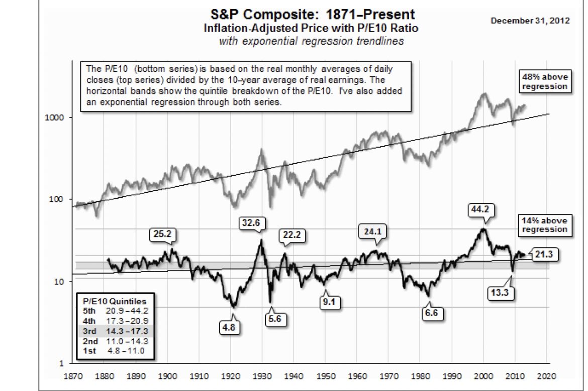
Figure 8.1 shows the S&P Composite on a monthly basis adjusted for inflation, back to 1871, with a regression line so you can get a feel (visually) of where the current price is relative to the long-term trend of prices. The lower plot is the Shiller PE10 plot, with peaks and troughs identified with their values. You can see that all prior secular bears ended with PE10 as a single digit (4.8, 5.6, 9.1, and 6.6). The PE10, on March 9, 2009, only got down to 13.3, which is considerably higher than the level reached by all prior secular bear lows. Based on this simple analogy, I think we have yet to see the secular bear low for this cycle. Remember, it does not mean that the prices have to go lower than they did in 2009; it just means the PE10 should drop to single digits. Remember, PE is a ratio of Price over Earnings. To make the ratio smaller, either the price can decline, the earnings can increase, or a combination of both.
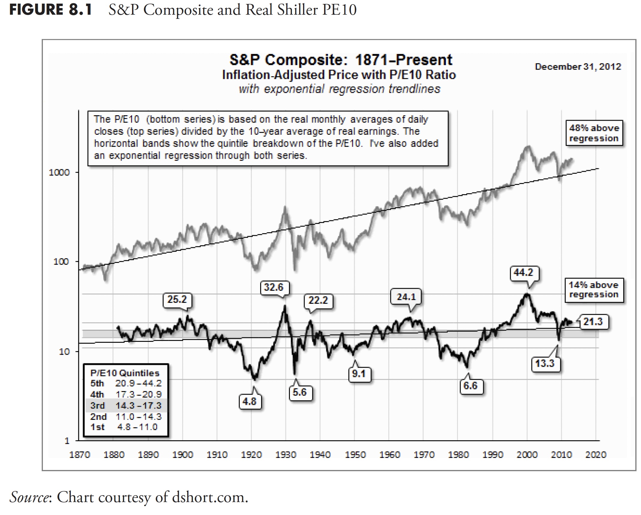
As of December 31, 2012, the PE10 is at 21.3. Referencing the small box in the lower left corner shows that this value is in the fifth quintile of all the PE data. Based on this analysis, the market is overvalued.
So when the financial news noise is constantly parading analysts by touting the PE as overvalued or undervalued, you can count on the fact that they are using the forward PE ratio. The forward ratio is the guess of all the earnings analysts. They are rarely correct. Ignore them.
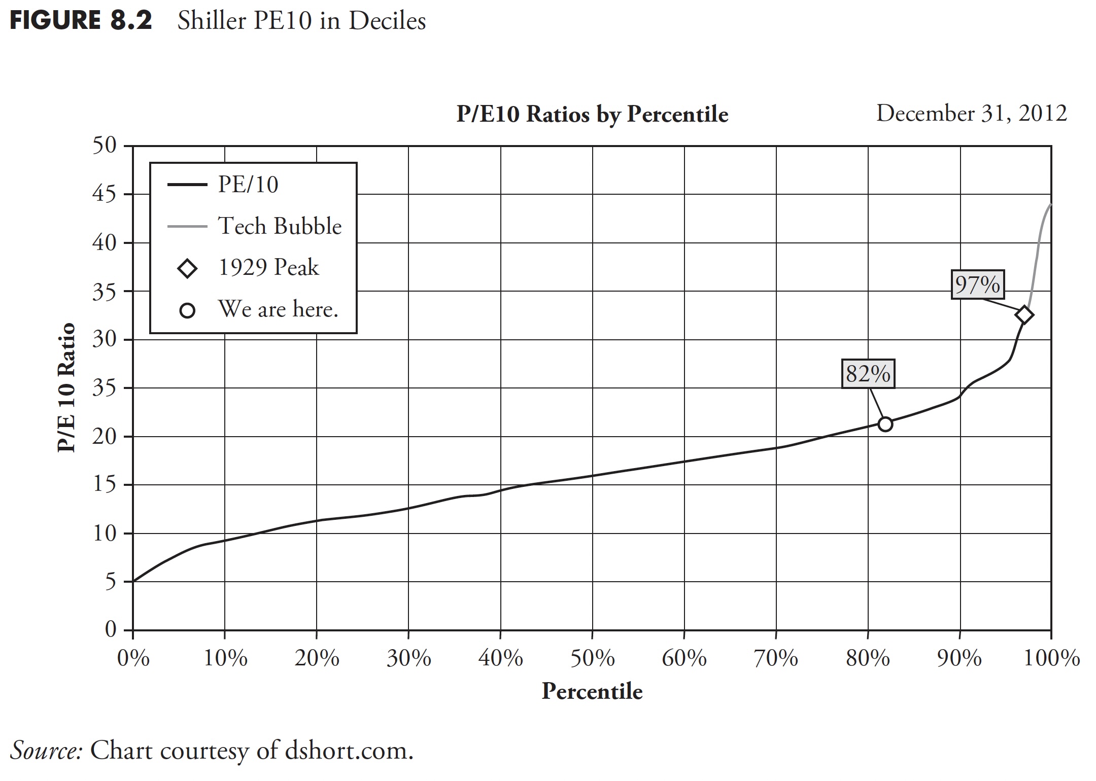
Finally, Figure 8.2 shows the PE10 in 10 percent increments or deciles. It shows the extreme level reached in the late 1990s from the tech bubble, it shows the 1929 peak, and it shows that, as of December 31, 2012, we are at the 82nd percentile of PE10. This puts the PE10 overvalued on a relative basis, and also on an absolute basis, as shown in Figure 8.1. Remember, PE10 used real reported (trailing) earnings, not forward (guess) earnings. As Doug Short says on his website at dshort.com: A more cautionary observation is that when the PE10 has fallen from the top to the second quintile, it has eventually declined to the first quintile and bottomed in single digits. Based on the latest 10-year earnings average, to reach a PE10 in the high single digits would require an S&P 500 price decline below 540. Of course, a happier alternative would be for corporate earnings to continue their strong and prolonged surge. If the 2009 trough was not a PE10 bottom, when would we see it occur? These secular declines have ranged in length from more than 19 years to as few as three. As of December 31, 2012, the decline in valuations was approaching its 13th year.
Secular Bear Valuation
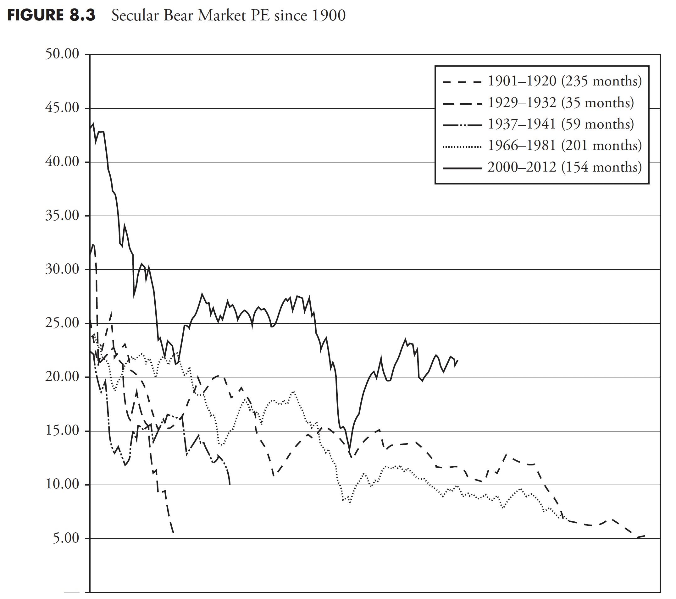
Figure 8.3 shows the Shiller PE10 monthly for all the past secular bear markets since 1900, with the current secular bear (as of 2013) in bold. What is really interesting about this chart is that most of the secular bears began with PE Ratios in the 20 to 30 range and ended with them in the 5 to 10 range. The current secular bear began with a PE in the mid-40s and is now only back down to the level that the previous secular bears began. That could imply that the secular bear that began in 2000 could be a long one. These charts were created using monthly data; if yearly data were used, the concept would be even more pronounced.
Secular Bear Valuation Composite
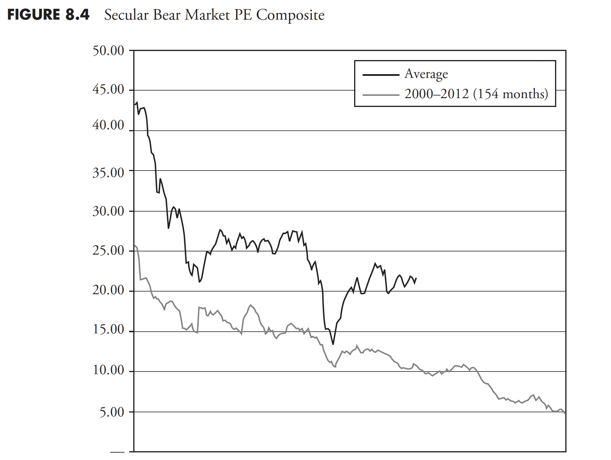
In Figure 8.4, the current secular bear market valuation is shown in bold, with the other line representing the average of the previous four secular bears. Again, this type of analysis is just an observation and for educational purposes; you cannot make investment decisions from this. Investment decisions come from actionable information and analysis.
Secular Bull Valuation
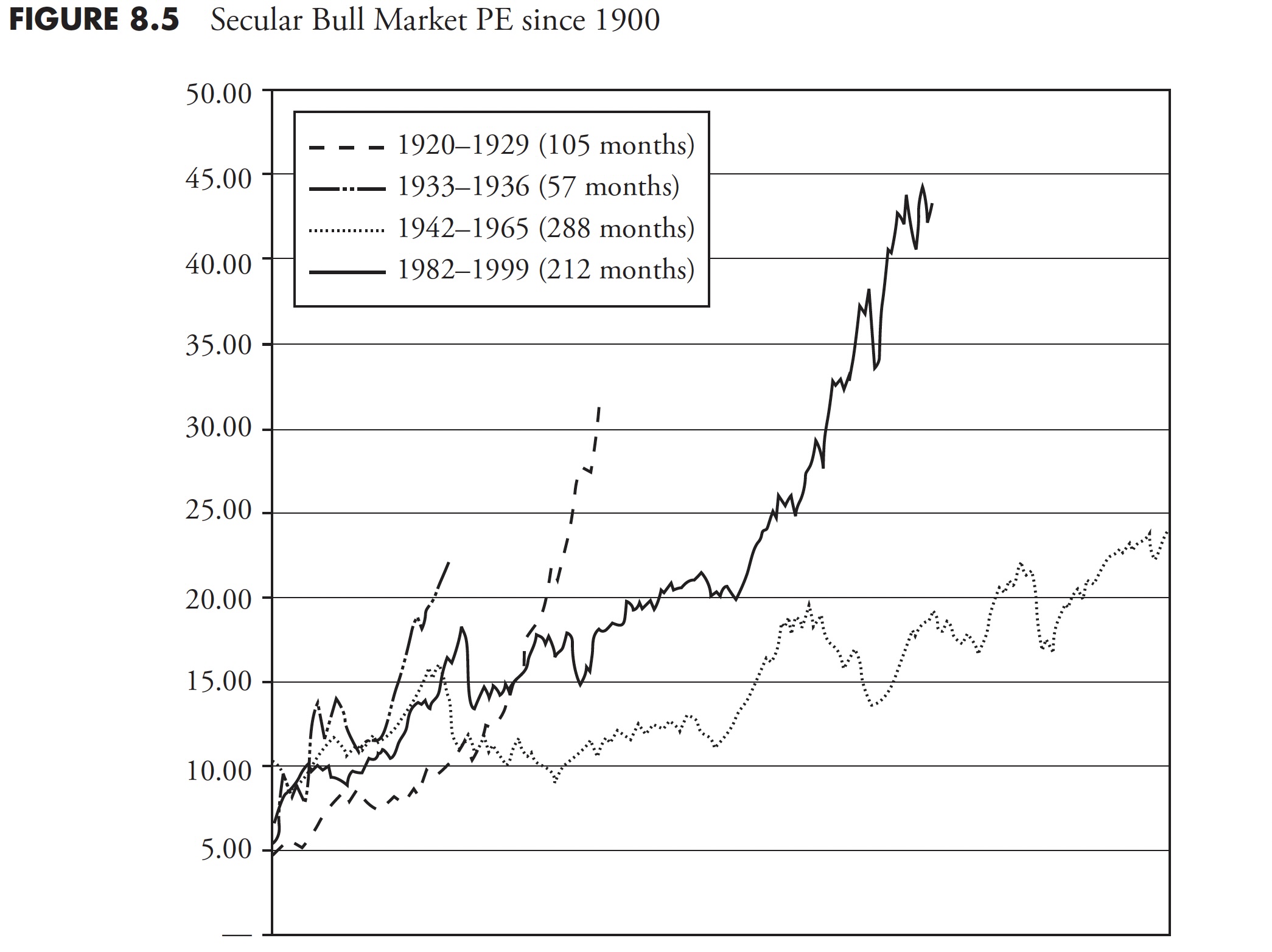
Figure 8.5 of secular bull market valuations shows that most of them begin with PE ratios in the 5 to 10 (same as where secular bears end) and they end with PE ratios in the 20 to 30 range. The excessive secular bull of 1982 to 2000 reached unbelievable high valuations. I remember everyone saying that this time was different. Wrong!
Secular Bull Valuation Composite
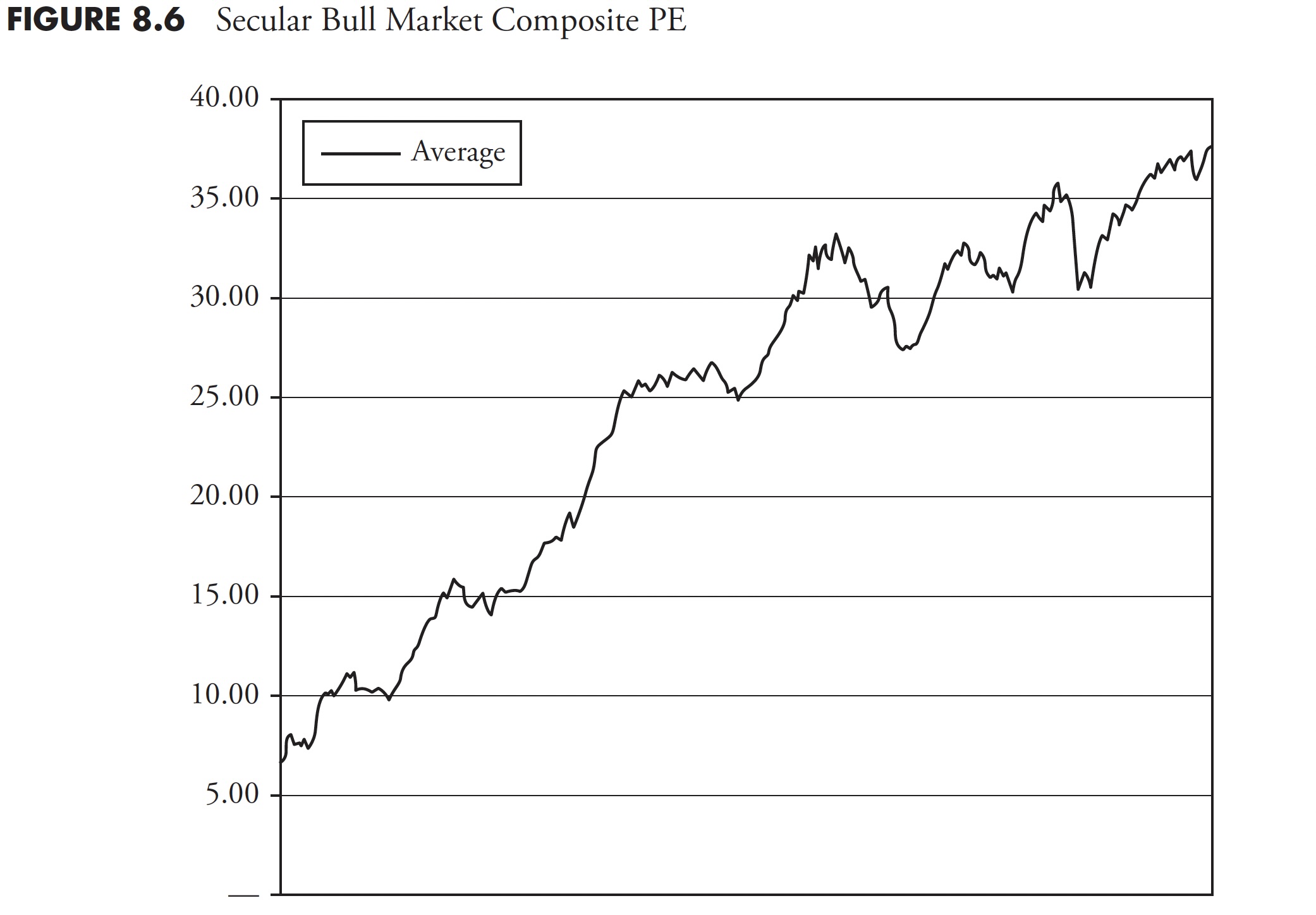
The secular bull market valuation composite is shown in Figure 8.6. It is the average of all the secular bull markets since 1900. Since we are currently in a secular bear market, the average of the secular bull markets is shown by itself.
Market Sectors
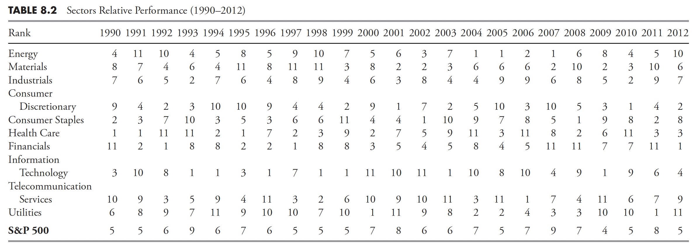
I use the sector definitions provided by Standard & Poor’s, of which there are 10. The other primary source for sector analysis is Dow Jones. Either is fine, I just prefer the S&P structure because I have been using it for so long. Table 8.1 shows the 10 sectors’ annual price performance since 1990, and Table 8.2 shows the relative performance of the total returns. When viewing a table of relative returns as in Table 8.2, keep in mind that each column (year) is completely independent of the preceding year or following year. Also, the relative ranking shows that those in the top part of the column outperformed those in the lower part of the column, independent of whether the returns were positive, negative, or a combination. Another value of this type of table is to show that picking last year’s top performer is not a good strategy. Remember, you cannot retire on relative returns.

This book does not get into the various uses of sectors as investments, but the book would not be complete without the mention of sector rotation and, in particular, how various sectors rotate in and out of favor based on the phase of the business cycle and the economy. A further delineation of sectors is their propensity to fall within the broad categories of offensive and defensive. This means that when the market is performing poorly, the defensive sectors will generally outperform, and when the market is performing well, it is the offensive sectors that are the top performers.
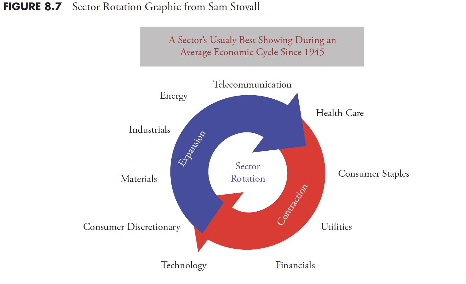
The phases of the economy known as economic expansions and contractions are affected by many events but generally boil down to recessions and periods of expansion. It should be noted, however, that not all contractions end up being recessions. The phases can then be broken down into early cycle, mid-cycle, and late cycle segments of the full cycle. There is a lot of literature available to cover all these details, but the point of this discussion is to show the rotational movement of the various sectors through the economic cycle.
Figure 8.7 is a graphic showing the sectors and where they fall in the cycle. It shows the rotation of sectors during an average economic cycle for the past 67 years and is courtesy of Sam Stovall, chief equity strategist, S&P Capital IQ. Sam wrote one of the best books on sector rotation years ago, Standard & Poor’s Sector Investing: How to Buy the Right Stock in the Right Industry at The Right Time, but is currently out of print as of 2013.
Another excellent study I have seen on the cycles within the phases and what sectors are affected was put out by Fidelity and dated August 23, 2010 (see Table 8.3). It clearly showed that, from 1963 through 2010, the following sectors were strongest during the various phases. In each cycle, the top-performing sectors are shown, with the first being the best of the four and the last being the worst of the top four, which is still the fourth best out of the 10 sectors.
It was interesting to note in this study that during all of the three cycles, Utilities and Healthcare were the two worst-performing of all 10 of the sectors (not shown). They only ranked in the top four during actual recessions. Since recessions are usually identified by the NBER about a year after they begin and sometime not until they have ended, this is not knowledge that you can make investment decisions with.

However, you can use a momentum analysis and always be in the top four sectors and probably do well. Clearly, this is certainly better than buy-and-hold or index investing.
Figure 8.8 shows the S&P 500 in the top plot and my Offensive-Defensive Measure in the lower plot. The concept of the Offensive-Defensive Measure is simple.
The Offensive Components
- Consumer Discretionary
- Financials
- Industrials
- Information Technology
The Defensive Components
- Consumer Staples
- Utilities
- Healthcare
- Telecom
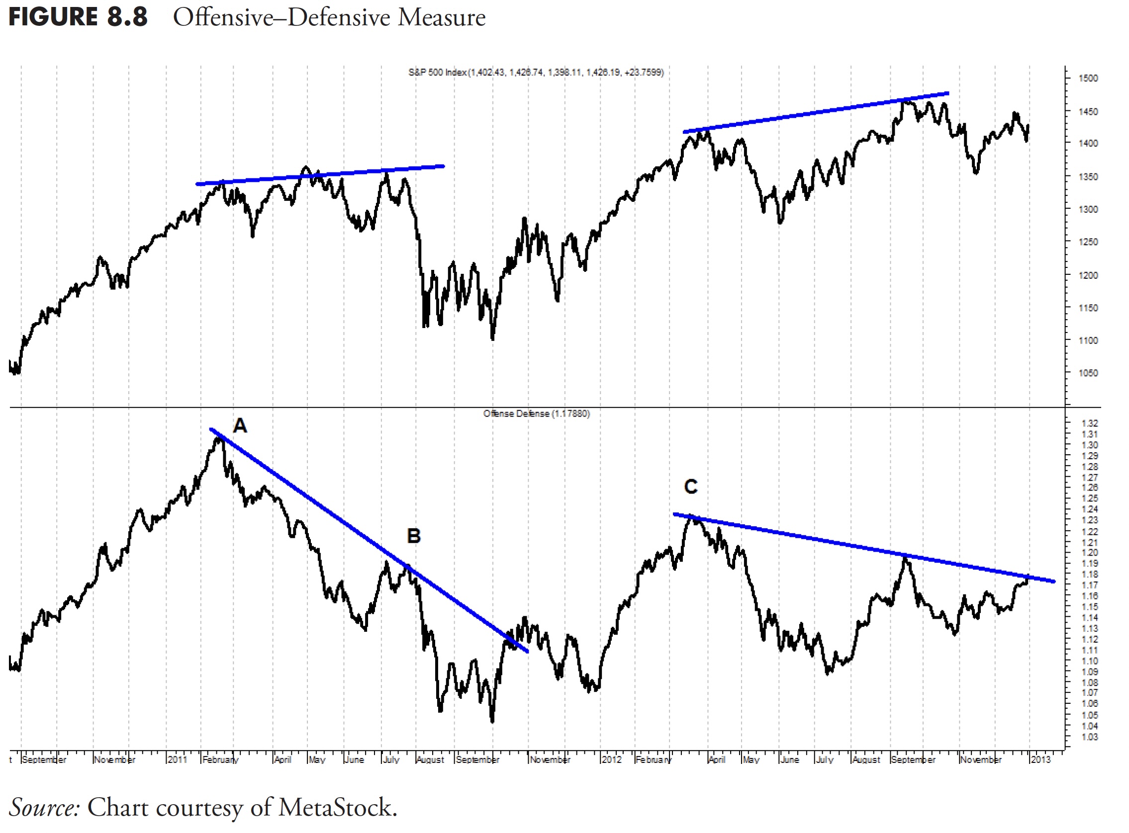
You can see that the rally from the left side of the chart to point A (February, 2011) was strong; however, based on the switch from offensive to defensive sectors that occurred at point A, the investors were clearly concerned about the market. While the market traded sideways for months (see top plot), the defensive sectors were clearly in the lead, causing the offense-defense measure to decline. The measure declined significantly, and it wasn’t until point B (July 2011) that the market finally gave up and headed south.
Sector Rotation in 3D
Julius de Kempenaer has created a novel way of visualizing sector-rotation, or, more generally, “market-rotation,” in such a way that the relative position of all elements in a universe (sectors, asset classes, individual equities, etc.) can be analyzed in one single graph instead of having to browse through all possible combinations. This graphical representation is called a Relative Rotation Graph or RRG. As of 2013, Julius is now working together with Trevor Neil to further research and implement the use of RRGs in the investment process of investment companies, funds, and individual investors. More information can be found on their website www.relativerotationgraphs.com.
A Relative Rotation Graph takes two inputs that together combine into an RRG. I’ll use the S&P Sectors for this discussion. The first step is to come up with a measure of relative strength of a sector versus the S&P 500; this is done by taking a ratio between each sector and the S&P 500. Analyzing the slope and pace of these individual RS lines gives a pretty good clue about individual comparisons versus their benchmark. These raw RS lines answer “good” or “bad.” However, they do not answer “how good” or “how bad” or “best” and “worst.” The reason for this is that Raw RS values (sector/benchmark) for the various elements in the universe are like apples and oranges, as they cannot be compared based on their numerical value.
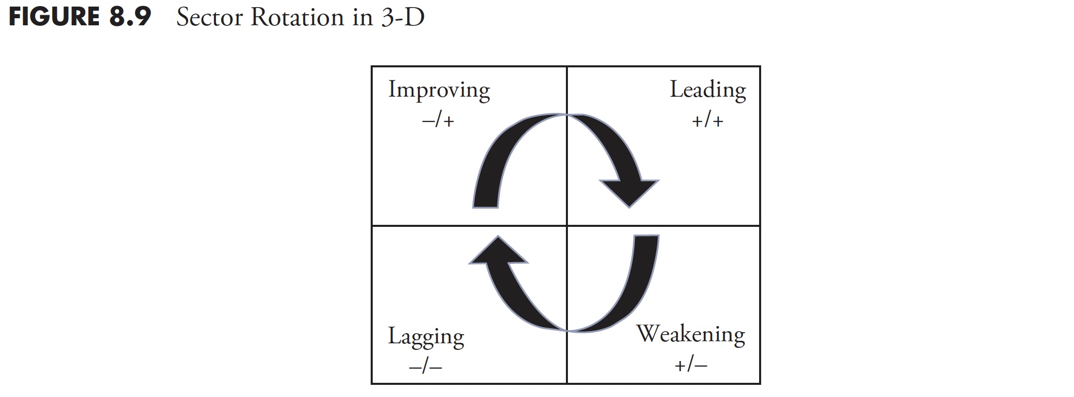
Taking the relative positions of all elements in a universe into account in a uniform way enables “ranking.” This process normalizes the various ratios in such a way that their values can be compared as apples to apples, not only against the benchmark but also against each other. The resulting numerical value is known as the JdK RS-Ratio—the higher the value, the better the relative strength. Additionally, not only the level of the ratio, but also the direction and the pace at which it is moving, affects the outcome. A concept similar to the well-known MACD indicator is used to measure the Rate of Change or Momentum of the JdK RS-Ratio line. Here also, it is important to maintain comparable values so another normalization algorithm is applied to the ROC; this line is known as the JdK RS-Momentum. The RRG now has JdK RS-Ratio for the abscissa (X axis) and the JdK RS-Momentum for the ordinate (Y axis). Graphically, the rotation looks like Figure 8.9.
In Figure 8.10, the sectors that are showing strong relative strength, which is still being pushed higher by strong momentum, will show up in the top-right quadrant. By default, the Rate of Change will start to flatten first, then begin to move down. When that happens, the sector moves into the bottom-right quadrant. Here, we find the sectors that are still showing positive relative strength, but with declining momentum. If this deterioration continues, the sector will move into the bottom-left quadrant. These are the sectors with negative relative strength, which is being pushed farther down by negative momentum. Once again, by default, the JdK RS-Momentum value will start to move up first, which will push the sector into the top-left quadrant. This where relative strength is still weak (i.e. < 100 on the JdK RS-Ratio axis) but its momentum is moving up. Finally, if the strength persists, the sector will be pushed into the top-right quadrant again, completing a full rotation.
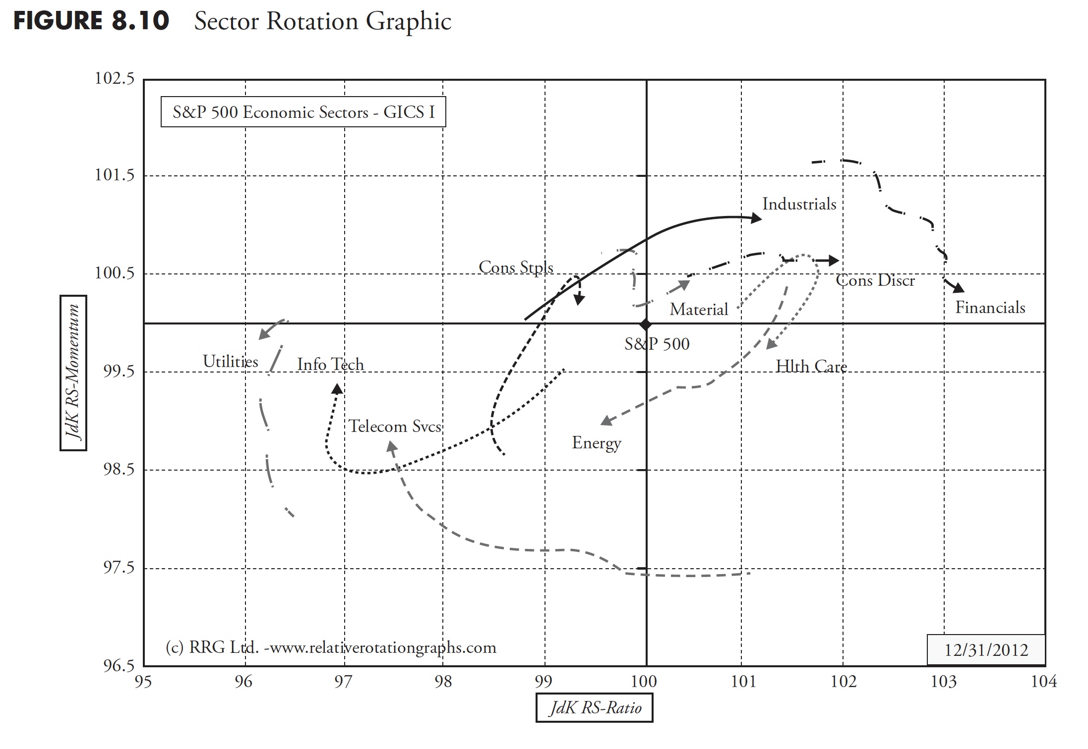
The next step is to add the third dimension, time, to the plot to visualize the data on a periodic basis and in fact, somewhat like watching a flip chart or animation in which you can see the movement of each of the sectors around the chart as shown in Figure 8.10.
This technology, in static form, is available on the Bloomberg professional service since January 2011 as a native function (RRG<GO>) where users can set their desired universes, benchmarks, lookback periods, and so on. On their aforementioned website, Julius and Trevor maintain a number of RRGs, static and dynamic (animated rotation), on popular universes like the S&P 500 sectors (GICS I & II). Several professional as well as retail software vendors and websites are working to embed the RRG technology in their products, which should make this unique visualization tool available to a wider audience.
Asset Classes
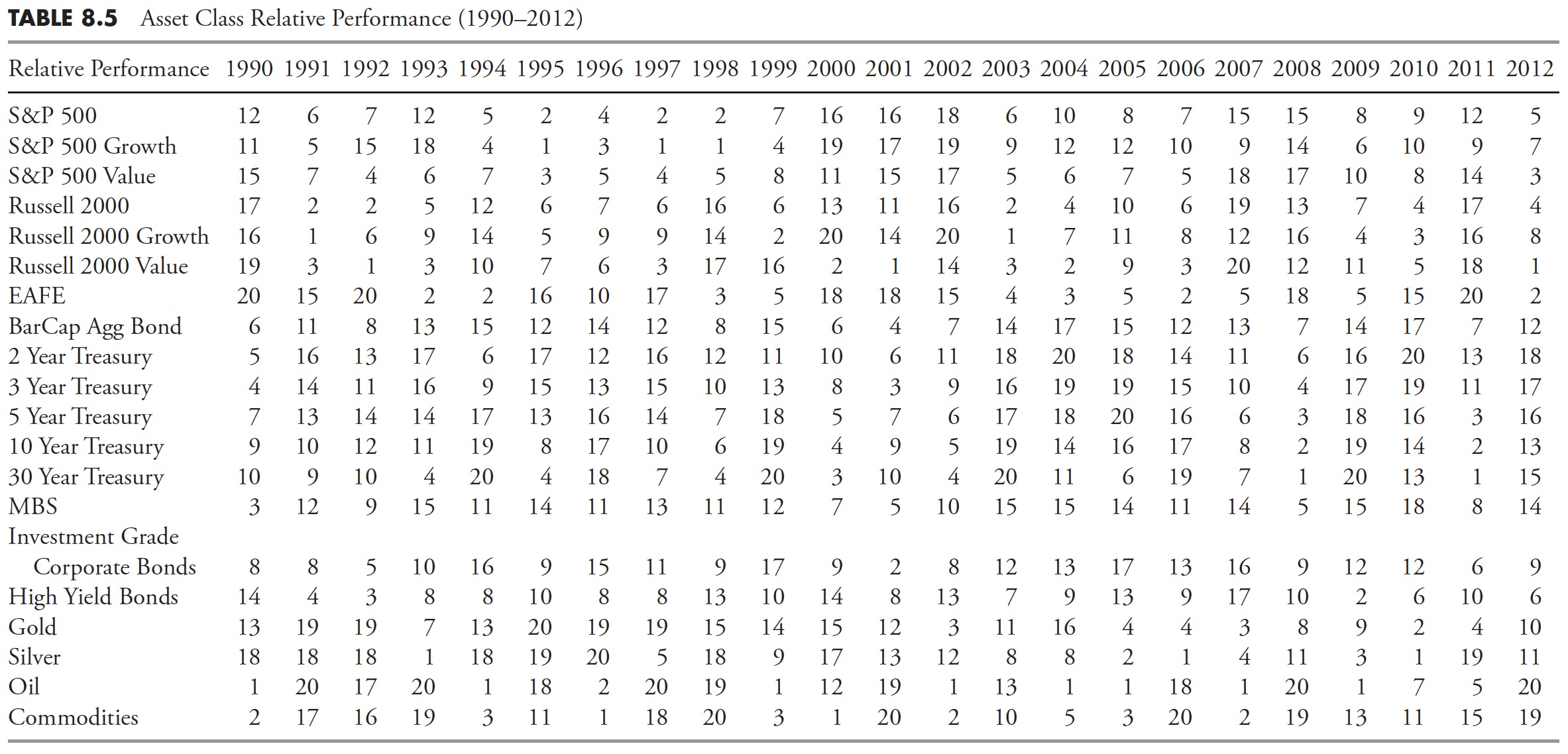
Asset classes can be analyzed exactly the same as market sectors. The only limitation is that they are not tied as closely to economic cycles as sectors, so it is more difficult to identify those that are offensive or defensive. Table 8.4 shows the price performance of a multitude of asset classes. Remember, this table is only showing the annual performance of each asset for each year since 1990, while Table 8.5 has the asset classes ranked each year numerically. Normally, this type of table is shown with multiple colors, but somewhat difficult in a black-and-white book, so rankings are shown. Again, remember that the rankings only show the relative performance, and each year is totally independent of the preceding or following year.

The Lost Decade
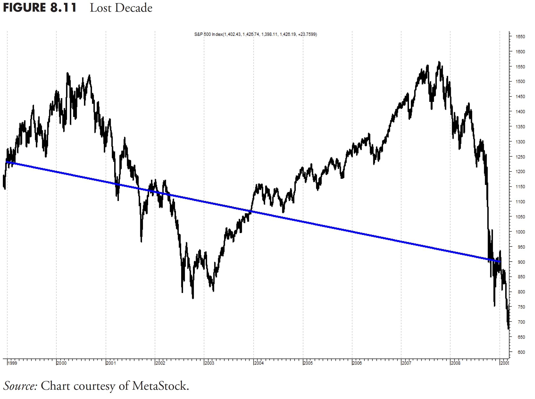
Figure 8.11 shows the S&P 500 Total Return from December 31, 1998, to December 31, 2008. Two huge bear markets and two good bull markets. If you have a strategy that could capture a good portion of those bull markets and avoid a good portion of those bear markets, you would do really well. Buy and hold has lost money over this period.
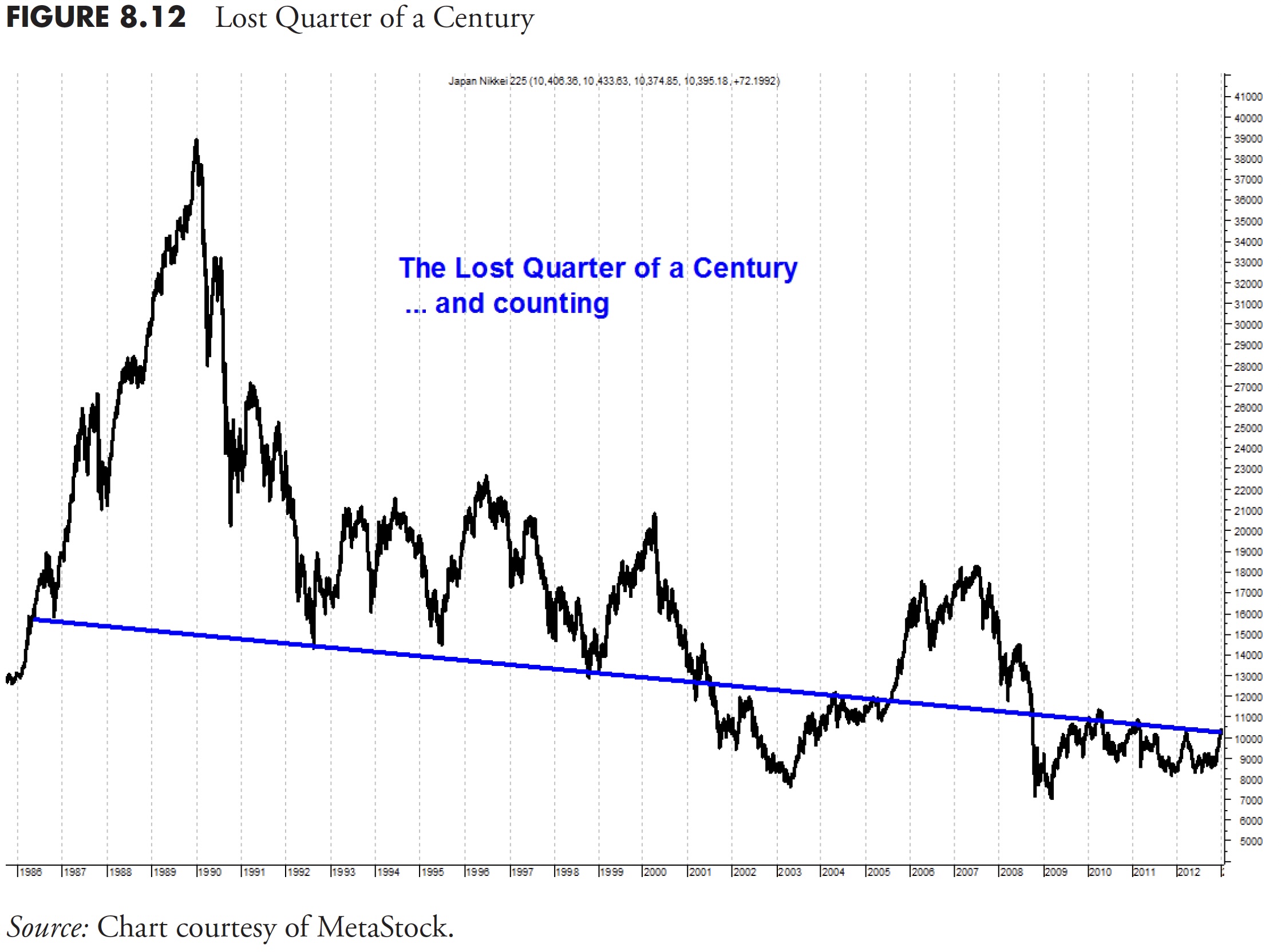
I get asked all the time, “Are we going to have another bear market?” I answer that I can guarantee you that we will; I just have no idea when it will be. However, we can turn to another group of very bright people from the third-largest economy in the world (as of 2013) and look at their market. Figure 8.12 is the Japanese Nikkei from December 31, 1985, to December 31, 2011, a period of time of 26 years, over a quarter of a century.
Clearly, buy and hold was a devastating investment strategy, and the really bad news is that it still is. Figure 8.13 shows the up and down moves during this period, in which a good trend following strategy could have protected you from horrible devastation.
The percentage moves up are shown above the plot, and the percentage moves down are below the plot. These are the percentage moves for each of the up and downs you see on the chart. There were five cyclical bull moves of greater than 60 percent during this period. There were also five cyclical bear moves of greater than -40 percent. Remember, a 40 percent loss requires a gain of 66 percent just to get back to even. The small box in the lower right edge shows the decline from the market top in late December 1989 (–73.3 percent). A 73 percent decline requires a gain of 285 percent to get back even. Most people won’t live long enough for that to happen.
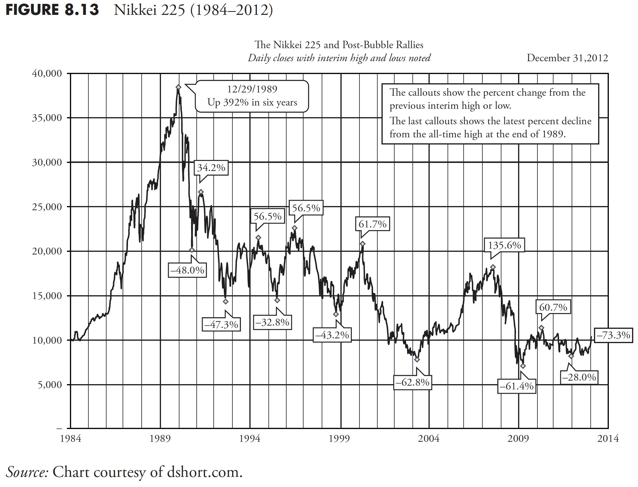
Finally, please notice that Figure 8.13 covers approximately 30 years of data and that the point on the right end (most recent value) is approximately equal to the starting point back in the mid-1980s; certainly the lost three decades. Buy and Hold is Buy and Hope.
Market Returns
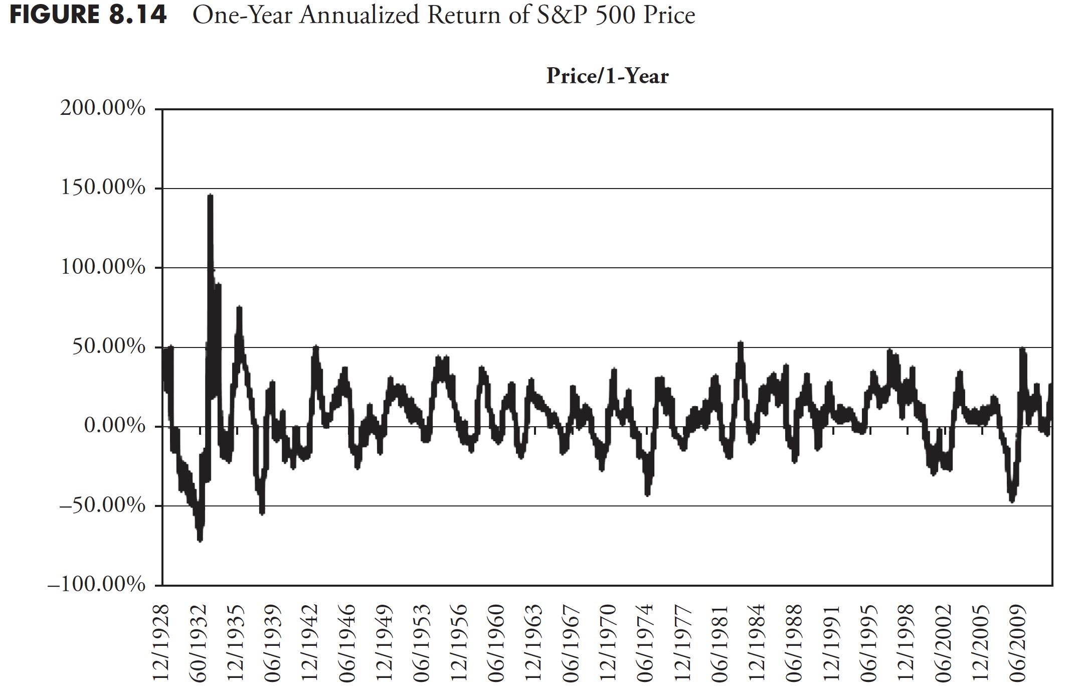
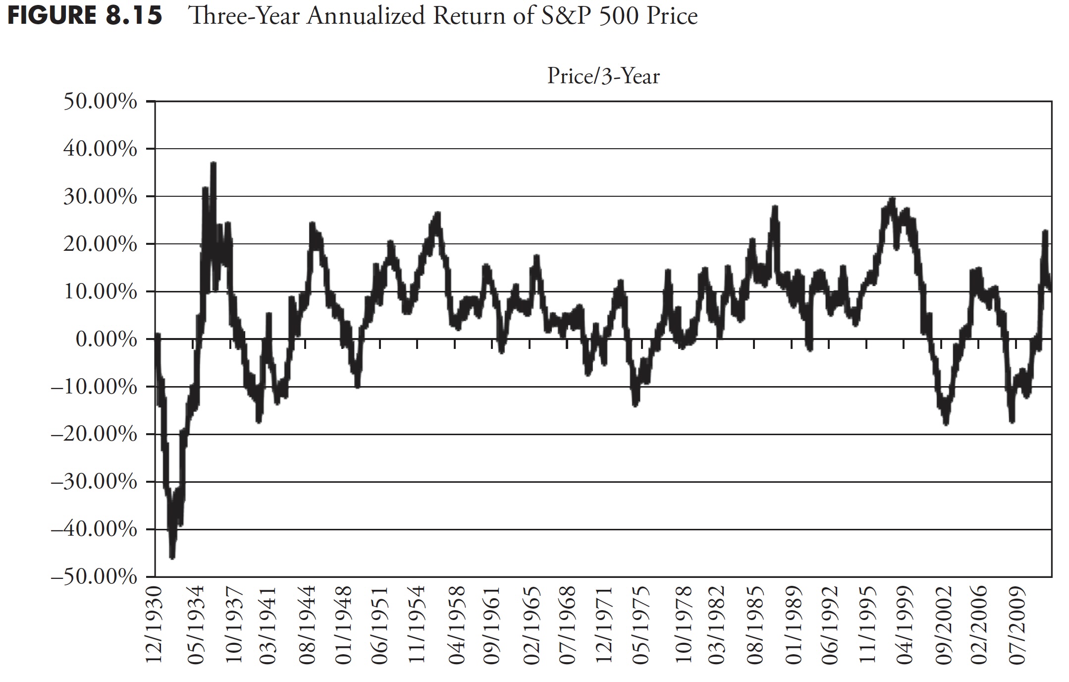
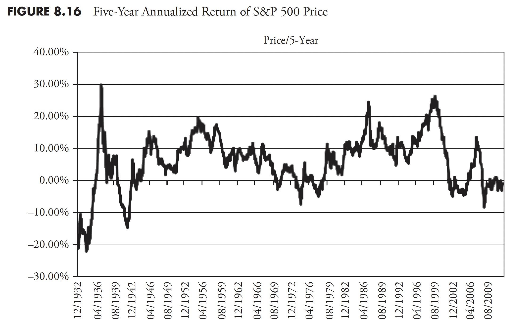
It is always good to see how the markets have performed in the past. With the advent of the internet, globalization, minute-by-minute news, investors have a natural tendency to focus on the short term. Without a knowledge of the long-term performance of the markets, that short-term orientation can cause one to be totally out of touch with the reality that the market does not always go up. The following charts will show annualized returns for the S&P 500 price, total return, and inflation-adjusted total return over various periods. These types of charts are also known as rolling return charts. As an example, using the 10-year annualized rolling return, the data begins in 1928, so the first data point would not be until 1938 and be the 10-year annualized return from 1928 to 1938. The next data point would be for the 10-year period from 1929 to 1939, the third from 1930 to 1940, and so on.
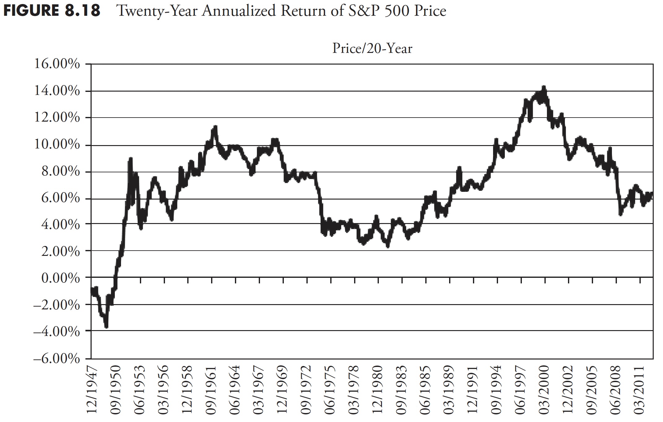
Figure 8.14 shows the 1-year annualized return for the S&P price. It should be obvious that one-year returns are all over the place, oscillating between highs in the 40 percent to 50 percent range, and lows in the -15 percent to -25 percent range. Following Figure 8.14 are the 3-year (Figure 8.15), 5-year (Figure 8.16), 10-year (Figure 8.17), and 20-year (Figure 8.18) charts of annualized returns, with the average for all the data shown in the chart caption. Following the 20-year chart is a further analysis for the 20-year period.
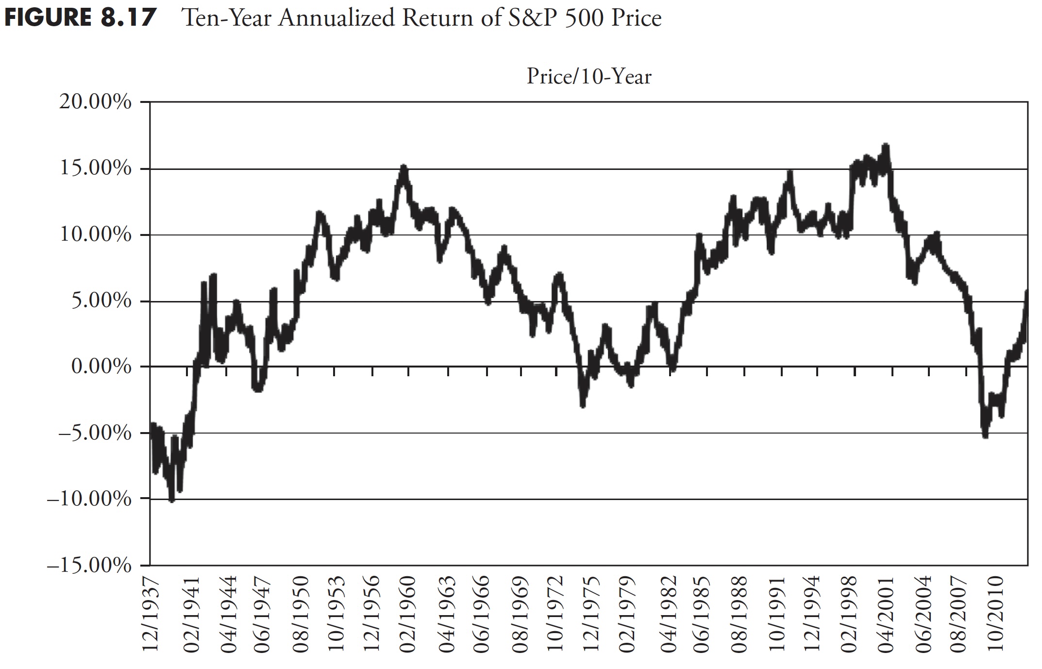
The 10-year return chart now clearly shows up-and-down trends in the data (see Figure 8.17).
The 20-year rolling return chart (Figure 8.18) continues to reduce the short-term volatility in the chart, and the up-and-down trends become clear.
Since I adamantly believe that most investors have about 20 years to really put money away in a serious manner for retirement, the following two charts show returns over 20 years for total return (Figure 8.19) and inflation-adjusted total return (Figure 8.20).
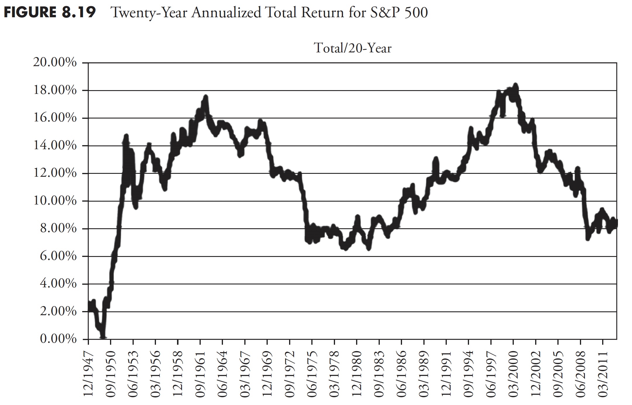
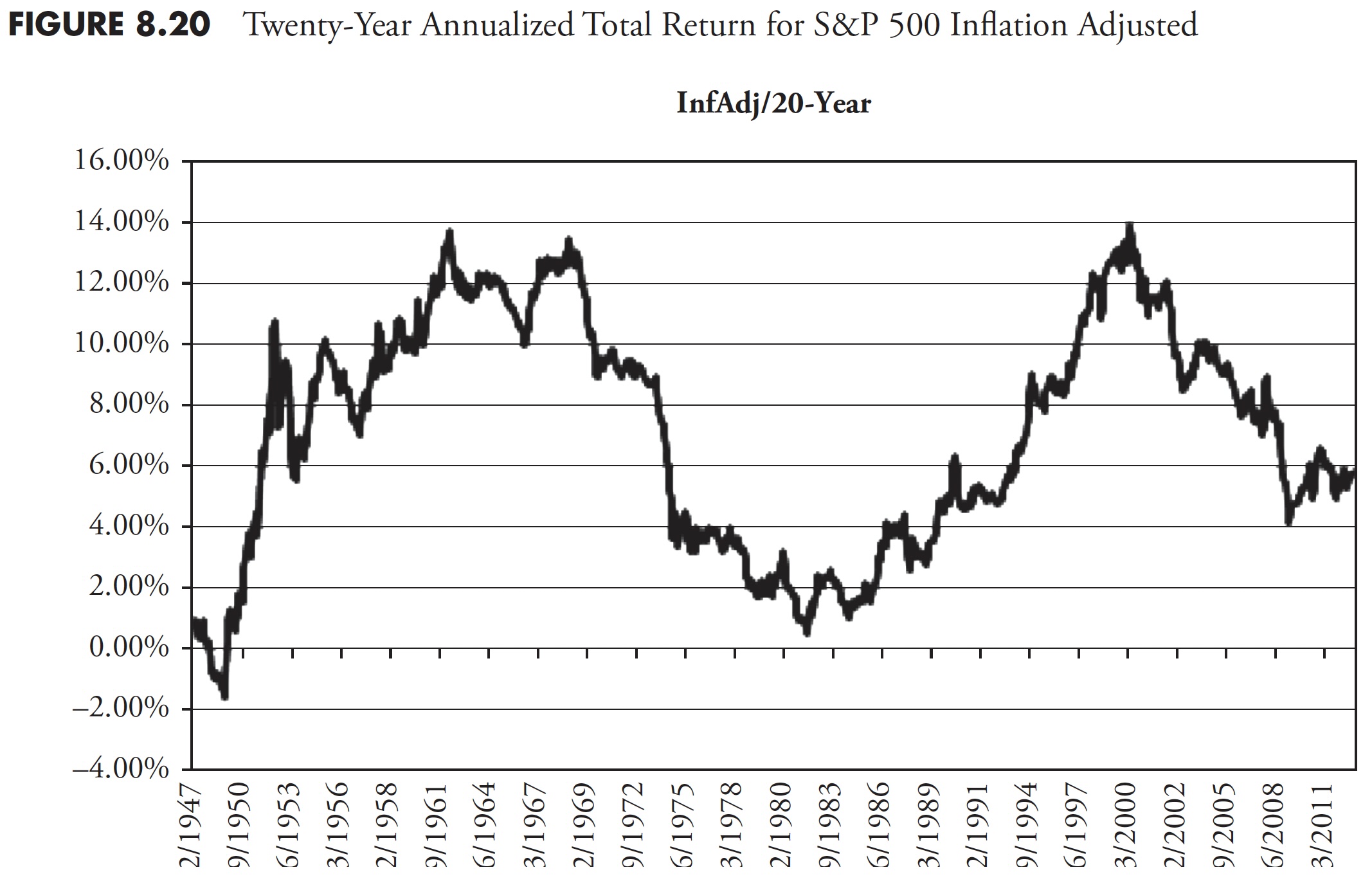
For most analysis, the Price chart is more than adequate. In the world of finance, there is an almost universal demand for the Total Return chart; however, I think that if you are going to insist on Total Return, you should then also insist on Inflation-Adjusted Total Return. Using the three preceding 20-year charts and the averages shown, you can see that the average for Price is 6.97 percent, Total Return is 11.32 percent, and Inflation-Adjusted Total Return is 7.19 percent. What this says is that the effect of including dividends (Total Return) and the effect of Inflation often neutralize each other.
Table 8.6 shows the annualized returns for the S&P 500 for price, total return, and inflation-adjusted total return for the following periods: 1-year, 2-year, 3-year, 5-year, 10-year, and 20-year.

Table 8.7 shows the minimum and maximum returns, along with the range of returns, their mean, median, and variability about their mean (Standard Deviation).

Distribution of Returns
The range of return data is very easy to calculate because it is simply the difference between the largest and the smallest values in a data set. Thus, range, including any outliers, is the actual spread of data. Range equals the difference between highest and lowest observed values. However, a great deal of information is ignored when computing the range, because only the largest and smallest data values are considered. The range value of a data set is greatly influenced by the presence of just one unusually large or small value (outlier). The disadvantage of using range is that it does not measure the spread of most of the values—it only measures the spread between highest and lowest values. As a result, other measures are required in order to give a better picture of the data spread. The monthly returns for the S&P 500 begin with December 1927, so, as of December 2012, there are 1,020 months (85 years) of data.
Additional charts show the distribution of data in various ways using the 20-year annualized returns of the S&P 500 inflation-adjusted total return data for rolling 20-year periods. Twenty-year returns from the S&P 500 with 1,020 months of data would yield 778 data points. Return distributions can be thought of like this: Each bar represents the proportion of the returns that meet a percentage division of the data, mathematical division of the data, or statistical division of the data. The following are definitions of the various distribution methods, as shown in the title of the following figures.
- Decile. One of 10 groups containing an equal number of the items that make up a frequency distribution. The range of returns is determined by the difference between the minimum and maximum returns in the series, then divided by 10 to create 10 equal groups.
- Quartile. The calculation is similar to decile (above), but with only four groupings.
(Note: This use of decile and quartile does not follow the standard definition or calculation method often used in statistics.)
- Standard deviation. A statistical measure of the amount by which a set of values differs from the arithmetical mean, equal to the square root of the mean of the differences’ squares. Figure 8.21 shows the percentage of the data that is included in a standard deviation. You can see that the mean is the peak and that 68.2 percent of the data is within one standard deviation from the mean, and 95.4 percent of the data is within two standard deviations of the mean.
- Percentage. A proportion stated in terms of one-hundredths that is calculated by multiplying a fraction by 100.
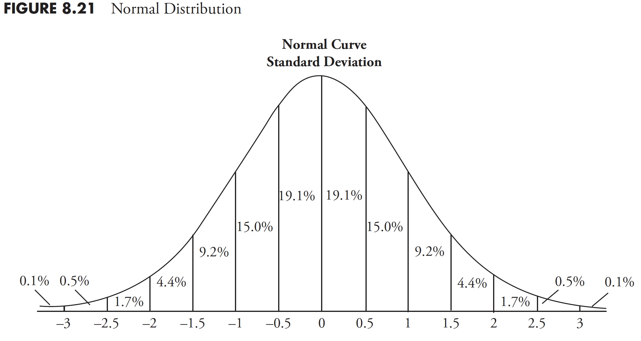
Figure 8.22 shows the 20-year rolling returns using inflation-adjusted total return data distributed by quartiles. From the chart, you can see that 13.24 percent of the returns fall into the first quartile, or lowest 25 percent, of the data, 28.15 percent in the second, 32.90 percent in the third, and 25.71 percent in the fourth quartile or highest 25 percent of the data.
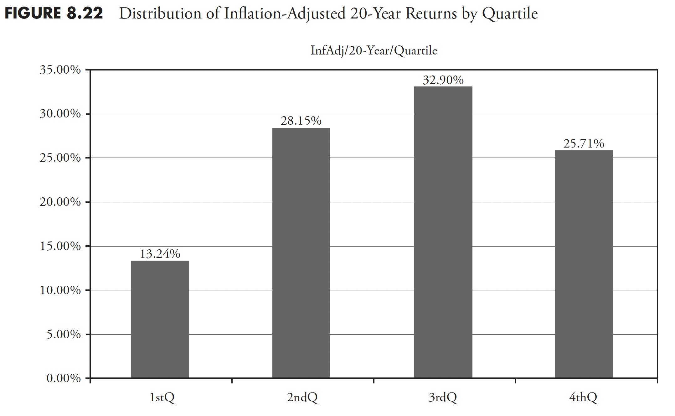
Figure 8.23 shows the same data, but in a decile distribution where each bar represents 10 percent of the number of data items. For example, 8.23 percent of the data fell in the highest 10 percent of the data.
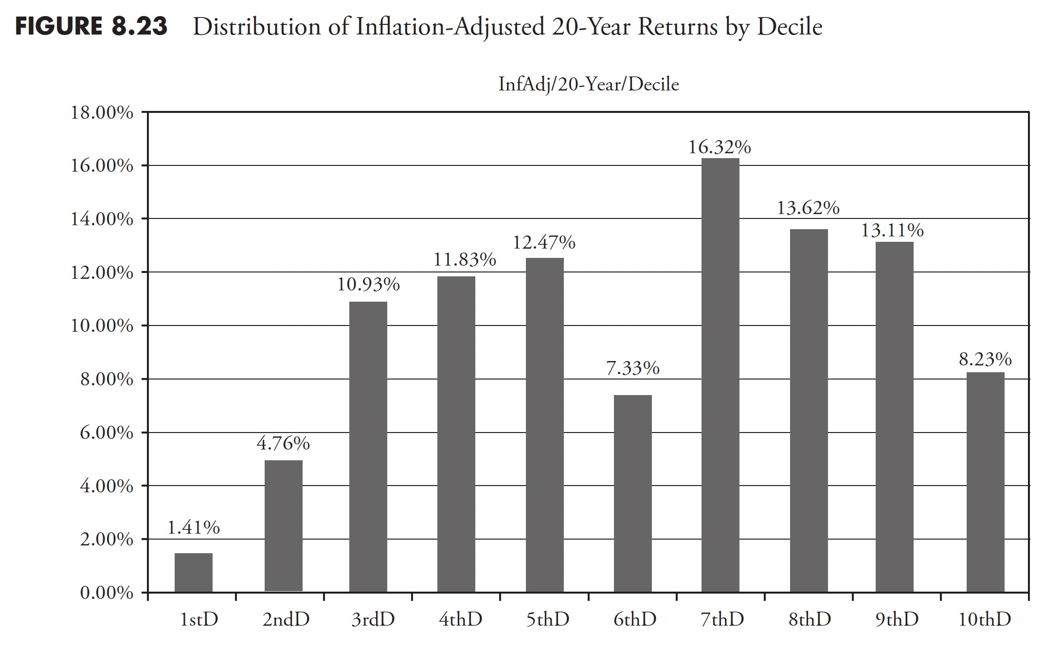
Figure 8.24 shows the distribution of the data based on variance from the mean or standard deviation. You can see that the two middle bars each represent 34.1 percent of the data (68.2 percent total) that is one standard deviation from the mean. As an example, 33.68 percent of the 20-year rolling returns data was within one standard deviation above the mean of all the data. You can also surmise that the two bars on the right represent 50 percent of all the data and 53.86 percent (33.68 + 20.18) of the returns. Oversimplifying this, one then knows that there were more returns greater than the mean. However, there is an asymmetrical distribution between the returns that are outside of one standard deviation from the mean, with the larger percentage to the downside.
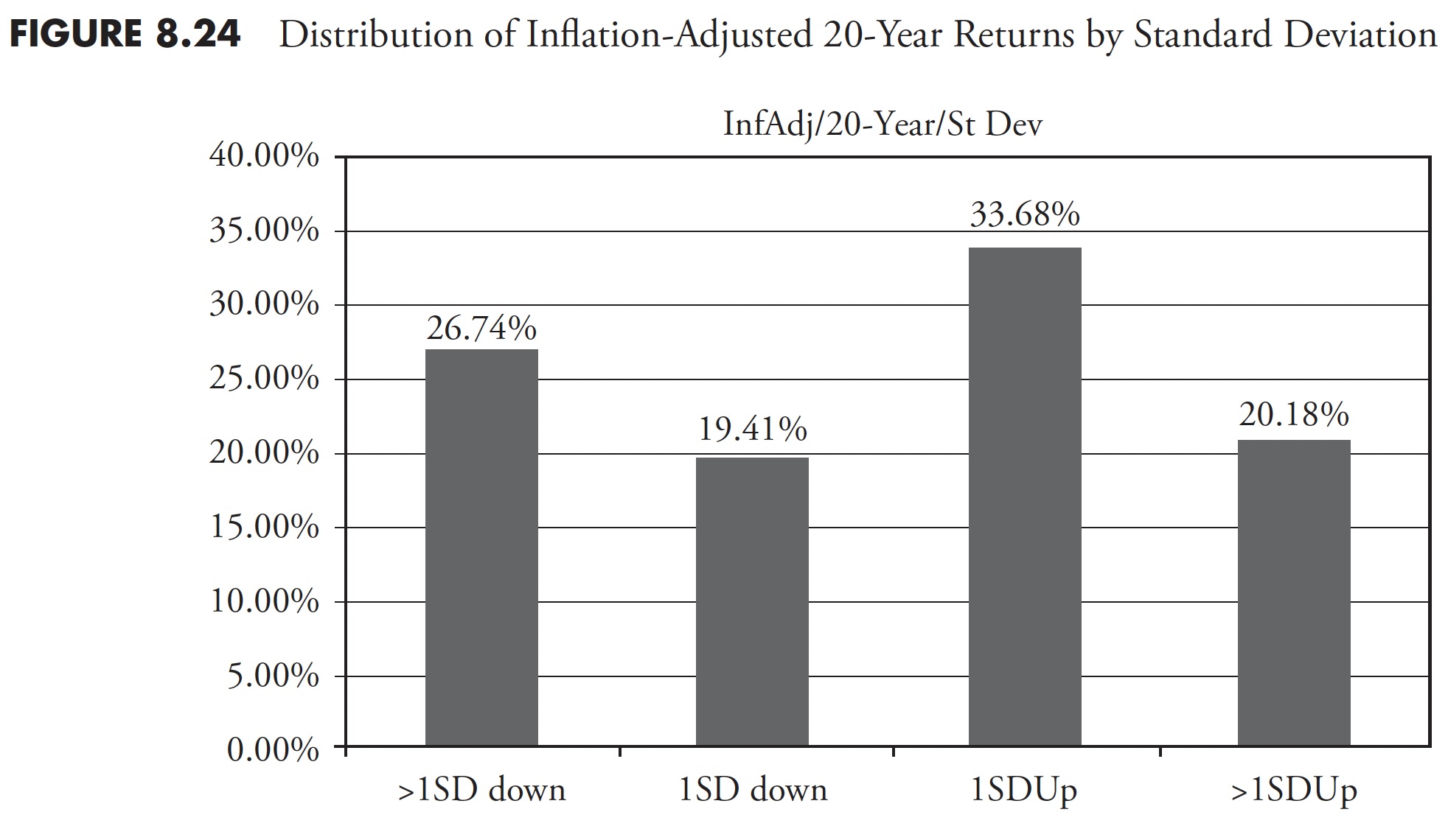
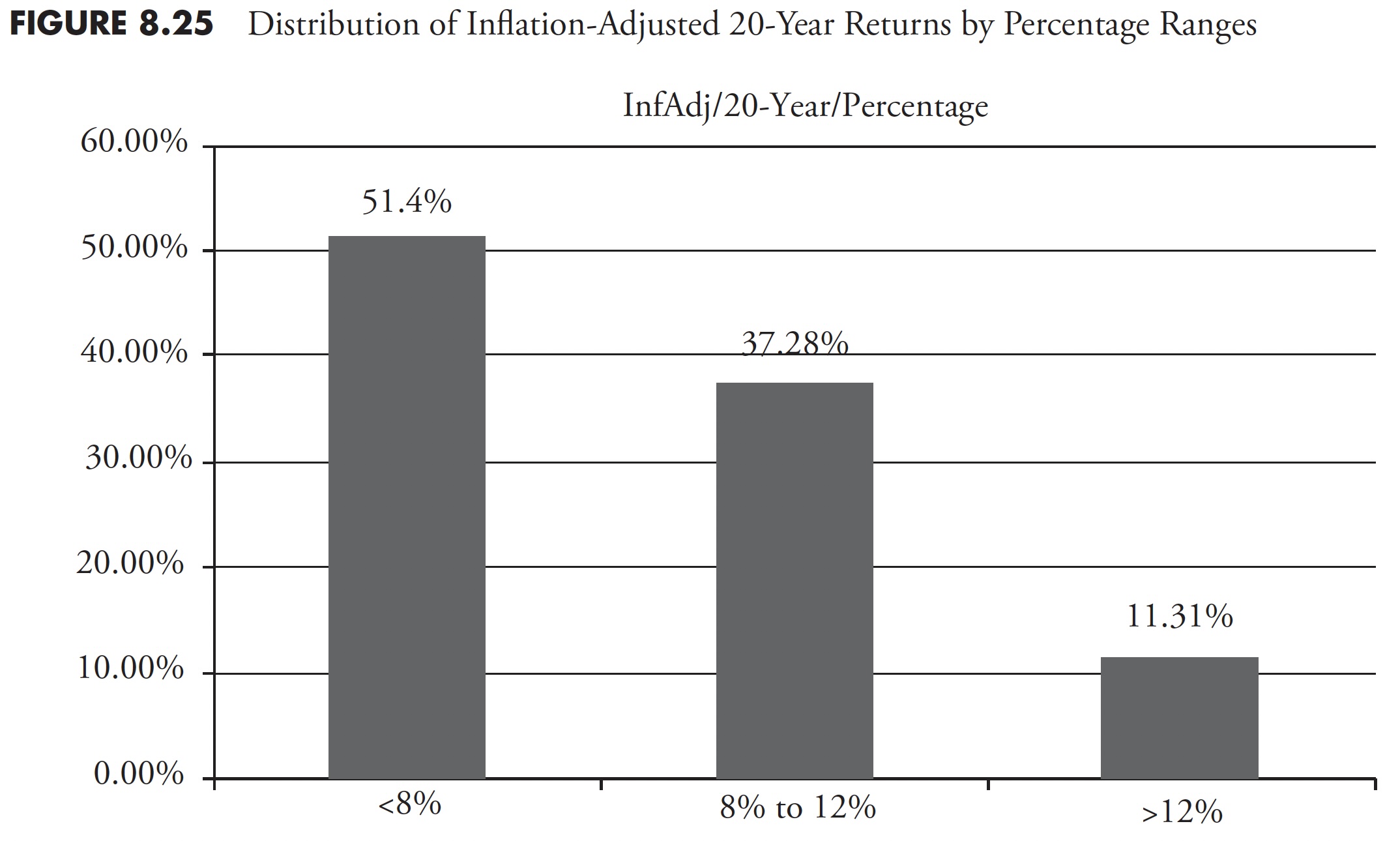
Figure 8.25 shows the 20-year rolling returns of the S&P 500 inflation-adjusted total return within percentage ranges. The bar on the left shows all the returns of less than 8 percent, which accounted for more than 50 percent of all returns (51.41 percent), while the bar on the right shows returns of greater than 12 percent, accounted for only 11.31 percent of all returns. The bar in the middle is the range of returns between 8 percent and 12 percent, which accounted for 37.28 percent of all returns. Recall the discussion in Chapter 4 on the deception of average, and once again the average 8 percent to 12 percent return is not average.
When the market starts to decline significantly, it is not the same as when someone yells “fire” in a theater. In a theater, everyone is running for the exits. In a big decline in the market, you can run for the exits, but first you have to find someone to replace you—you must find a buyer. Big difference! This chapter has attempted to stick to what I believe are market facts and essential information you should understand in regard to how markets work and have worked in the past. If one does not know market history, it would be very difficult to keep a focus on what the possibilities are in the future.
This concludes the first section of this book, where I have attempted to show you the many popular beliefs about the market that are used by academia and Wall Street to help sell their products. Part I also wraps up with what I believe to be truisms about the market. Part II has an introductory chapter on technical analysis and is followed by two chapters on extensive research into trend determination and risk/drawdowns.
Thanks for reading this far. I intend to publish one article in this series every week. Can’t wait? The book is for sale here.
